Customer Data Platform
Bringing Order to the System
Customer Data Platform
Bringing Order to the System
About
A Customer Data Platform (CDP) collects and unifies data from various sources to create a complete view of each customer. It helps businesses personalise experiences using both member data (like purchase history) and non-member interaction data (such as website visits).
My role
Design user flows, UI elements, organise interaction rules and logic, write user-friendly copy, and produce illustrations that align with the product’s style and usability needs.
Features
Design system, data management ,audience filter, marketing report, general settings and more
Platform
Web
Year
2024
UI design
UI design
UX design
UX design
B2B
B2B
Web
Web

From Fragmented to Systematic
From Fragmented to Systematic
From Fragmented to Systematic
This case study covers my short-term role as a UI/UX designer for a B2B customer data platform. It details my design process and how I applied technical UI skills.
Despite this being the 3rd version of the product, there was still no design system in place. The existing style was already defined, leaving little room for change, but the lack of a design library led to inconsistencies in fonts, paddings, and spacing. Alongside product development, I began building a design system from foundational elements like typography, colours, and spacing to common components.
Note: The company’s name was left out to respect confidentiality.
Problem
Problem
Design chaos & heavy workload
Design chaos & heavy workload
With just 2 designers and no design system, we constantly made one-off decisions on fonts, spacing, and styles, leading to inconsistencies.
With just 2 designers and no design system, we constantly made one-off decisions on fonts, spacing, and styles, leading to inconsistencies.
Unclear product logic
Unclear product logic
The product team often kicked off design work before finalising the logic, leading to endless back-and-forth revisions and unclear expectations.
The product team often kicked off design work before finalising the logic, leading to endless back-and-forth revisions and unclear expectations.
Lack of user insights
Without proper user research, we lacked clarity on usage scenarios and information hierarchy, making it harder to design user-centric experiences.
Without proper user research, we lacked clarity on usage scenarios and information hierarchy, making it harder to design user-centric experiences.
Solution
Solution
Building a design system
Building a design system
Instead of a full redesign, I focused on the fundamentals—typography, colours, spacing, icons—and gradually integrated them into new and existing features. Also, to lighten the engineering load, we kept most components close to Ant Design.
Instead of a full redesign, I focused on the fundamentals—typography, colours, spacing, icons—and gradually integrated them into new and existing features. Also, to lighten the engineering load, we kept most components close to Ant Design.
Helping untangle the product
Helping untangle the product
Worked closely with the product team to clarify logic and structure, ensuring that what we designed actually made sense.
Worked closely with the product team to clarify logic and structure, ensuring that what we designed actually made sense.
Looking outward for answers
Looking outward for answers
Studied similar products to understand what worked, helping us make smarter, more confident design decisions.
Studied similar products to understand what worked, helping us make smarter, more confident design decisions.
Organising the Design System
Organising the Design System
Organising the Design System
This section introduces the foundational elements of the design system to ensure clarity, usability, and consistency across the product, making it easier for both designers and developers to maintain a cohesive visual language throughout.
Although this system doesn’t require full accessibility compliance, B2B products thrive on clarity and usability in small details. With this in mind, I incorporated accessibility principles—adjusting line heights, colour contrast, and touch-friendly elements, making the interface more intuitive and effortless to use.
Design system
Design system
Font
Font
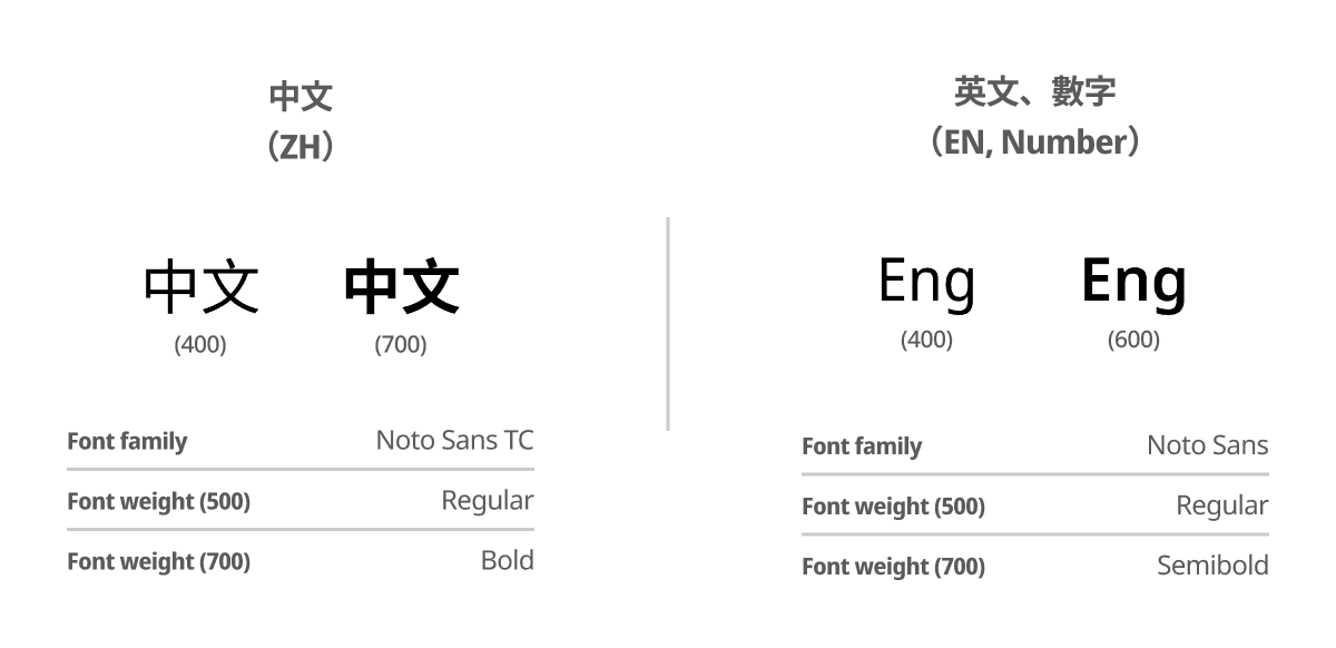
We redefined the role of each text style within the system, distinguishing between Chinese, English, and numeric characters. Additionally, we refined line heights to improve legibility and align with accessibility standards, ensuring a more user-friendly experience.
We redefined the role of each text style within the system, distinguishing between Chinese, English, and numeric characters. Additionally, we refined line heights to improve legibility and align with accessibility standards, ensuring a more user-friendly experience.
Design system
Design system
Colour
Colour

The colour range was limited, making darker shades less distinct. We expanded it to 0–1000 for better flexibility. For charts and key UI elements, we prioritised neutral colours with balanced brightness to ensure adaptability across brands while maintaining clarity.
The colour range was limited, making darker shades less distinct. We expanded it to 0–1000 for better flexibility. For charts and key UI elements, we prioritised neutral colours with balanced brightness to ensure adaptability across brands while maintaining clarity.
Design system
Design system
Component spacing
Component spacing
Spacing was previously inconsistent, making layouts unpredictable. By establishing clear spacing and gap definitions for each component, creating a structured and scalable system where every element has a well-defined size and placement.
Spacing was previously inconsistent, making layouts unpredictable. By establishing clear spacing and gap definitions for each component, creating a structured and scalable system where every element has a well-defined size and placement.
Design system
Design system
Corner radii
Corner radii
1
size
4
Checkbox
2
size
6
Select, input, button
3
size
12
Card, section
4
size
full
Radio button

I standardised corner radii to maintain a cohesive look across components, ensuring visual harmony and a polished, modern aesthetic.
I standardised corner radii to maintain a cohesive look across components, ensuring visual harmony and a polished, modern aesthetic.
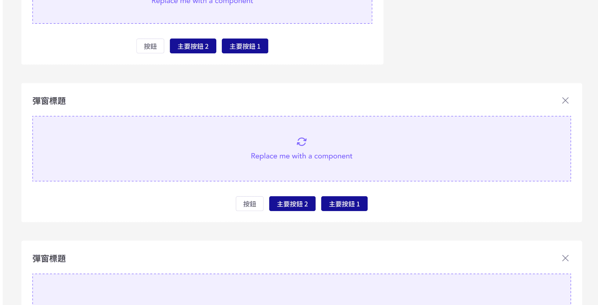
Design Walkthrough
Design Walkthrough
Design Walkthrough
A closer look at how our designs translate complex data into clear, actionable insights. These screens showcase key functions, from audience filtering to data visualisation.
A closer look at how our designs translate complex data into clear, actionable insights. These screens showcase key functions, from audience filtering to data visualisation.
A closer look at how our designs translate complex data into clear, actionable insights. These screens showcase key functions, from audience filtering to data visualisation.
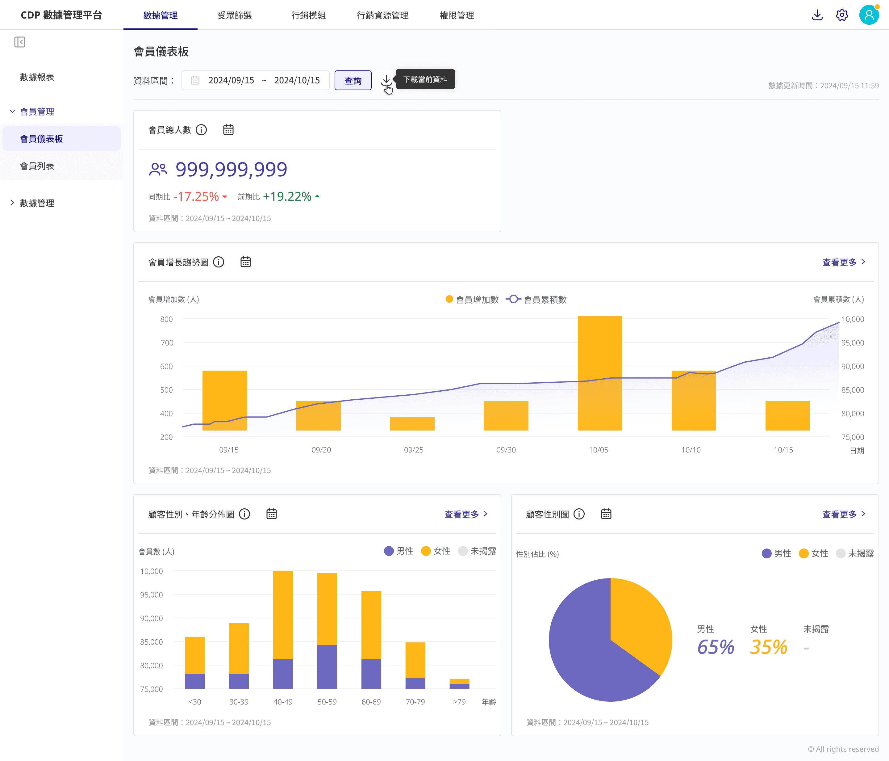
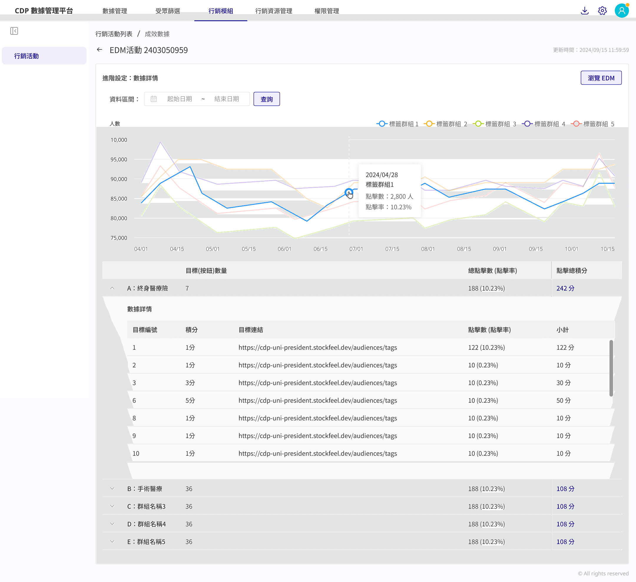
Data management
Data management
Data management
Data management involves collecting, organising, and maintaining data to ensure accuracy, accessibility, and security. In a Customer Data Platform (CDP), this means integrating data from multiple sources, standardising it, and structuring it for easy retrieval. To support this, we refined existing table components for better readability and introduced three chart sizes—small, medium, and full—to present data clearly while maintaining usability.
Data management involves collecting, organising, and maintaining data to ensure accuracy, accessibility, and security. In a Customer Data Platform (CDP), this means integrating data from multiple sources, standardising it, and structuring it for easy retrieval. To support this, we refined existing table components for better readability and introduced three chart sizes—small, medium, and full—to present data clearly while maintaining usability.

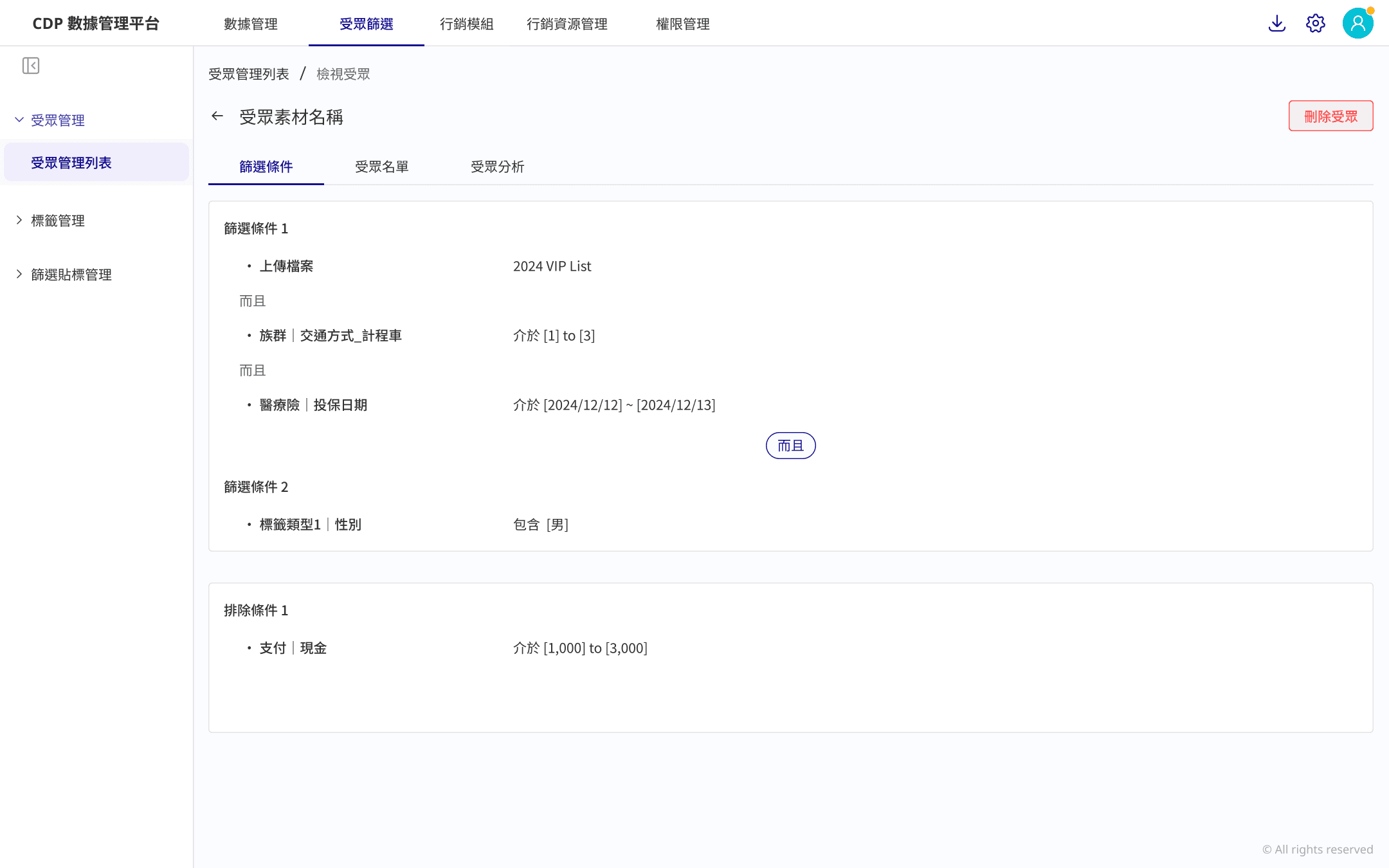
Audience filter
Audience filter
Audience filter
Allows users to narrow down their target audience by applying filters such as demographics, behaviours, or custom criteria, and assign tags for better organisation and tracking.
Allows users to narrow down their target audience by applying filters such as demographics, behaviours, or custom criteria, and assign tags for better organisation and tracking.


Marketing report
Marketing report
Marketing report
Simplified the marketing campaign process by allowing users to directly move from content editing to audience segmentation, then select trigger timing and conditions to complete the setup. This streamlined approach made it easier for users to create campaigns without complexity.
Simplified the marketing campaign process by allowing users to directly move from content editing to audience segmentation, then select trigger timing and conditions to complete the setup. This streamlined approach made it easier for users to create campaigns without complexity.

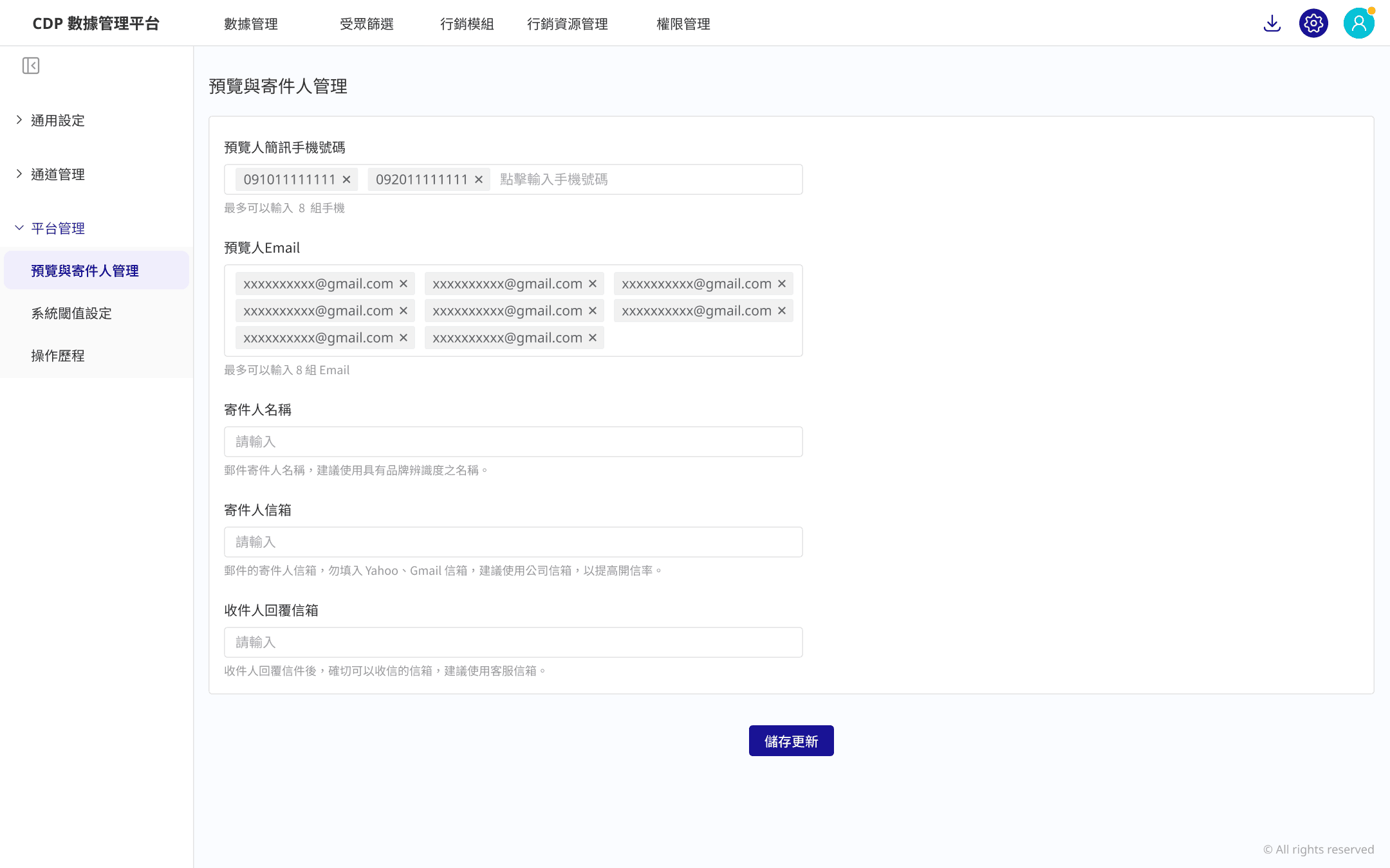
Platform settings
Platform settings
Platform settings
Simplified the marketing campaign process by allowing users to directly move from content editing to audience segmentation, then select trigger timing and conditions to complete the setup. This streamlined approach made it easier for users to create campaigns without complexity.
Simplified the marketing campaign process by allowing users to directly move from content editing to audience segmentation, then select trigger timing and conditions to complete the setup. This streamlined approach made it easier for users to create campaigns without complexity.
Customer Data Platform
Bringing Order to the System
About
A Customer Data Platform (CDP) collects and unifies data from various sources to create a complete view of each customer. It helps businesses personalise experiences using both member data (like purchase history) and non-member interaction data (such as website visits).
My role
Design user flows, UI elements, organise interaction rules and logic, write user-friendly copy, and produce illustrations that align with the product’s style and usability needs.
Features
Design system, data management ,audience filter, marketing report, general settings and more
Platform
Web
Year
2024
UI design
UI design
UX design
UX design
B2B
B2B